Home Page
Groups
TABLE OF CONTENTS
- Home Page
- Adding a Group to a Form
- Identifying a Group in the Builder
- Adding and Managing Elements Within a Group
- Managing Group Structure
- Common Use Case Example
- Styling Options
- Dependencies and Behavior
Groups are the foundational building blocks of forms in Screendragon. They provide a flexible container structure that organizes fields, controls data entry, and enables advanced configurations for workflows, reporting, and automation. Because of their versatility, groups offer virtually limitless possibilities for form design, but they also introduce complexity that requires careful planning and implementation.
A group can contain:
Fields (text, dropdowns, checkboxes, numeric, date, etc.)
Nested sub-groups for hierarchical data structures
Logic and validation rules to control behavior
Dynamic mappings to workflows, reports, and external systems
By leveraging groups, administrators can design forms that capture structured data, enforce business rules, and seamlessly integrate with other Screendragon modules such as Projects, Workflows, and Reports.
Adding a Group to a Form
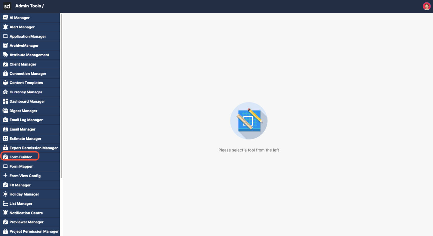
- Click the Admin Tools area from your main navigation page.
- Click Form Builder.
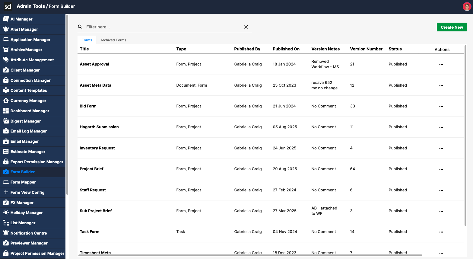
- Locate the form where you want to add a group.
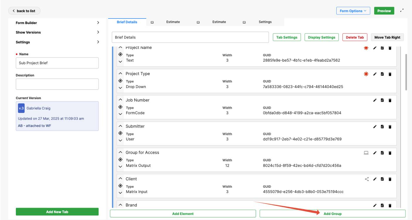
- Click Add Group.
- Begin completing the fields.
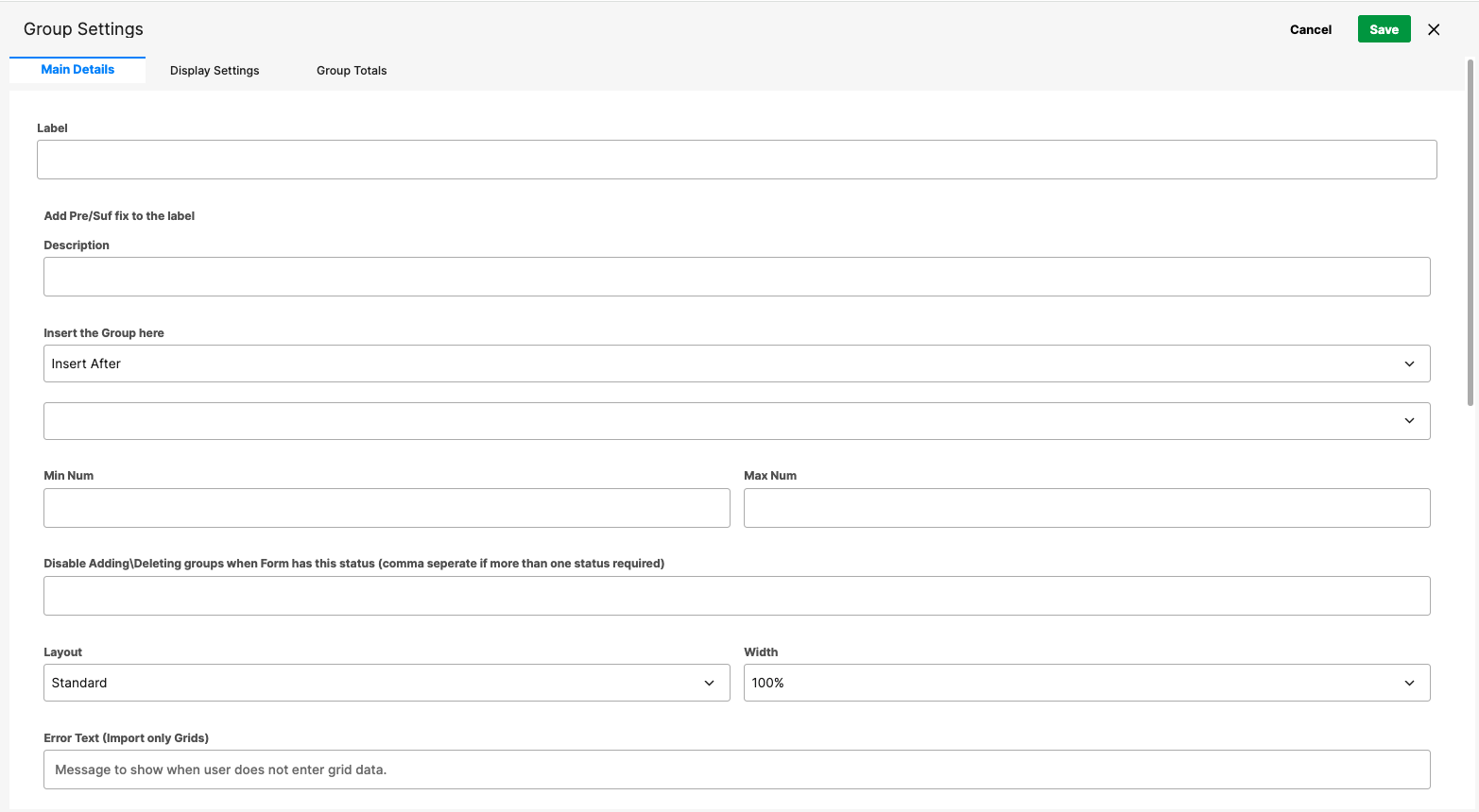
When creating a new group, configure the following settings:
Label
Enter the group name. This becomes the group title unless the title is configured to be hidden.
Description
You can also include a description for the group, if desired.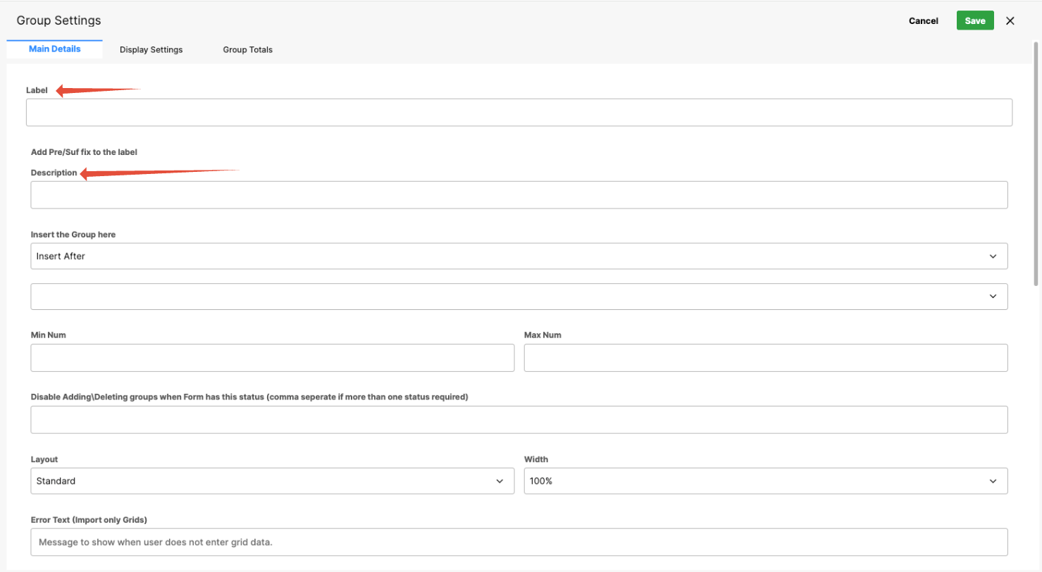
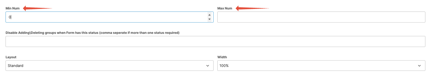
Minimum Number of Rows
Define how many rows appear by default.
Min = 0: The group starts with no rows.
Min = 1: One row appears by default and must be completed if the fields within the group are mandatory.
Maximum Number of Rows
Set the maximum number of rows users can add to the group.
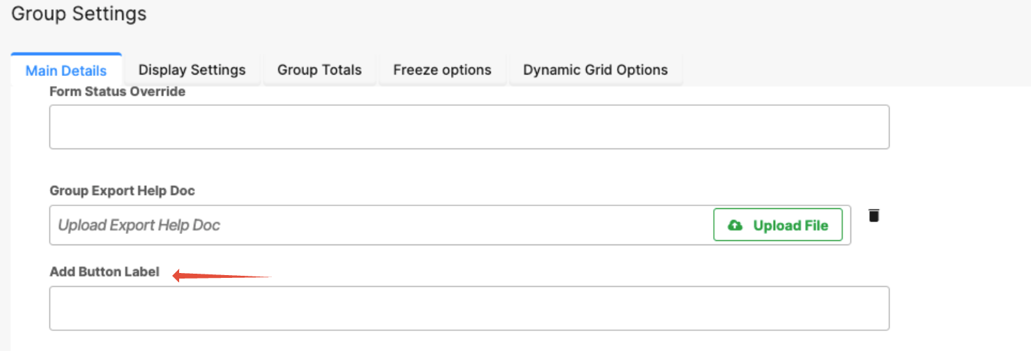
Add Button Label
Customize the text displayed on the Add button, such as Add File, Add Entry, or another context-specific label.
Matching Minimum and Maximum Values
If the minimum and maximum values are the same (for example, both set to 10), the system displays that number of rows by default, and users cannot add additional rows.
Identifying a Group in the Builder
In the Form Builder:
Groups are visually distinct; they appear as a boxed area containing the elements that belong to them.
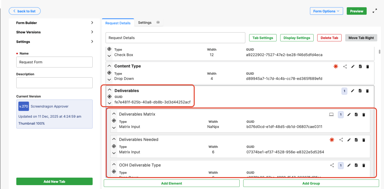
On the front end, the group also appears in its own visual box. 
Adding and Managing Elements Within a Group
Once a group has been created, you can add any supported field type within it, such as text fields, dropdowns, user fields, checkboxes, or file upload elements.
Each row created within the group will use the same field set and layout, ensuring consistent data entry across all rows.
Managing Group Structure
You can control which elements belong to a group using move actions:
Add elements to a group: Use the arrows to move elements into the group container.
Remove elements from a group: Use the arrows to move elements out of the group container.
This allows you to easily organize and restructure grouped fields as form requirements change.
Common Use Case Example
A common use of groups is to allow users to upload multiple files in a structured way.
To set this up, add a single File Upload field inside a group.
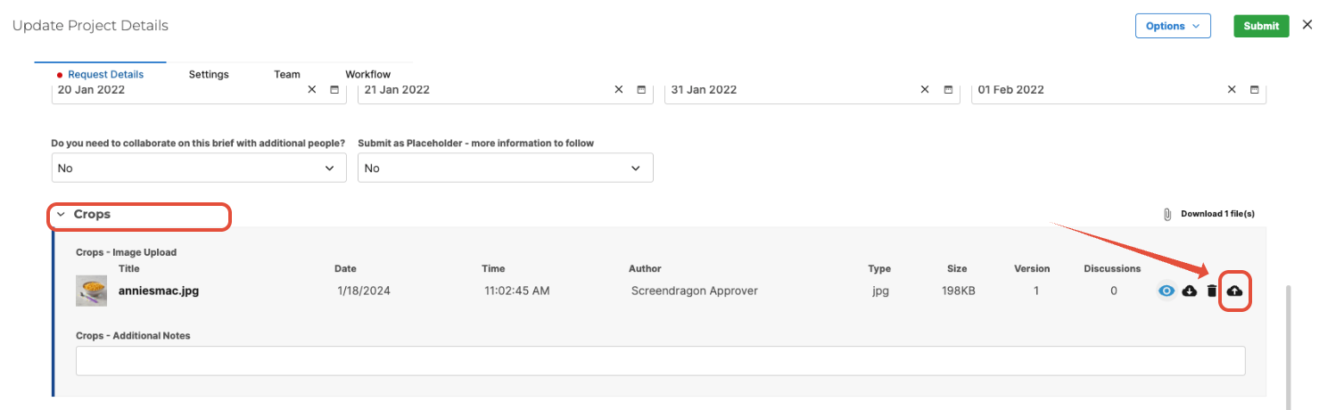
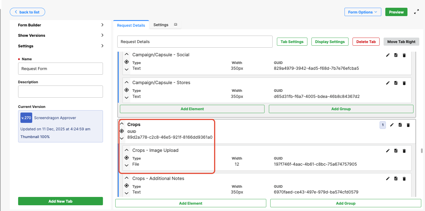
Users can click Add to create additional rows, each of which supports a separate file upload.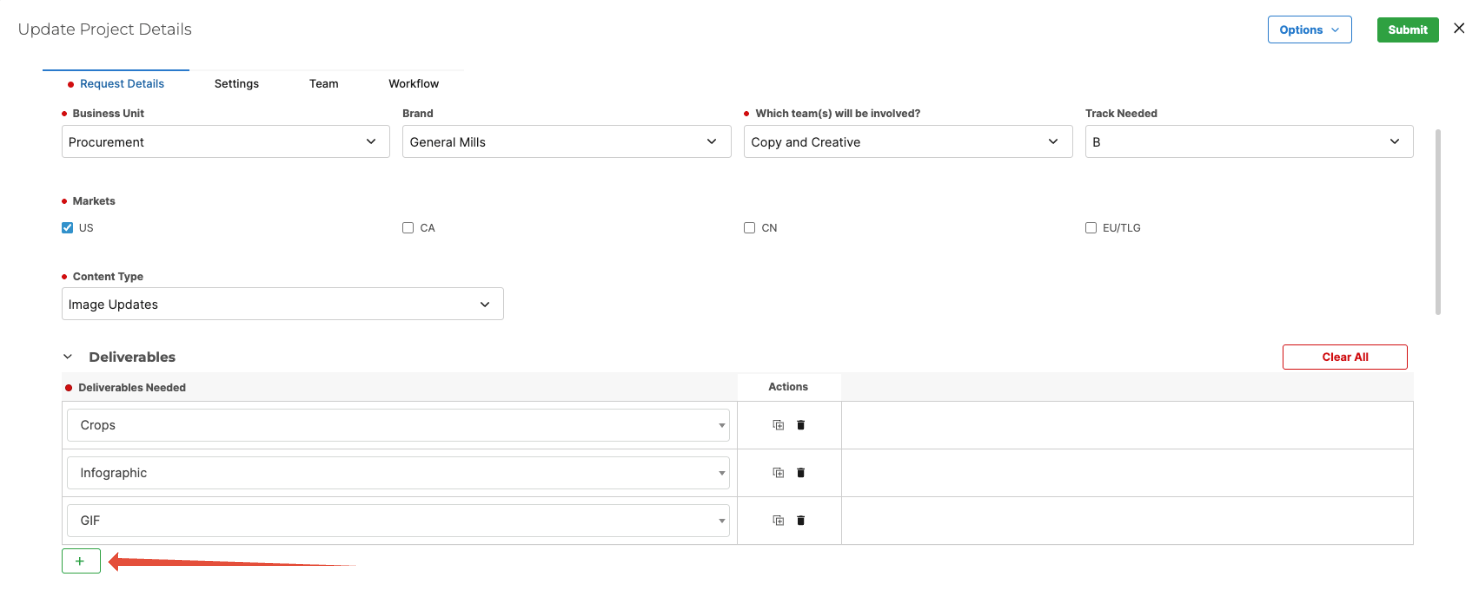
This approach provides a cleaner, more controlled experience than a single multi-file upload field, as each file can be managed within its own structured entry.
Styling Options
You can adjust a group's appearance to better match your form layout and user experience requirements.
Available styling options include:
- Hide Group Title — Removes the title or header text displayed above the group.
- Hide Grid Header — Hides the header row that labels each field column within the group.
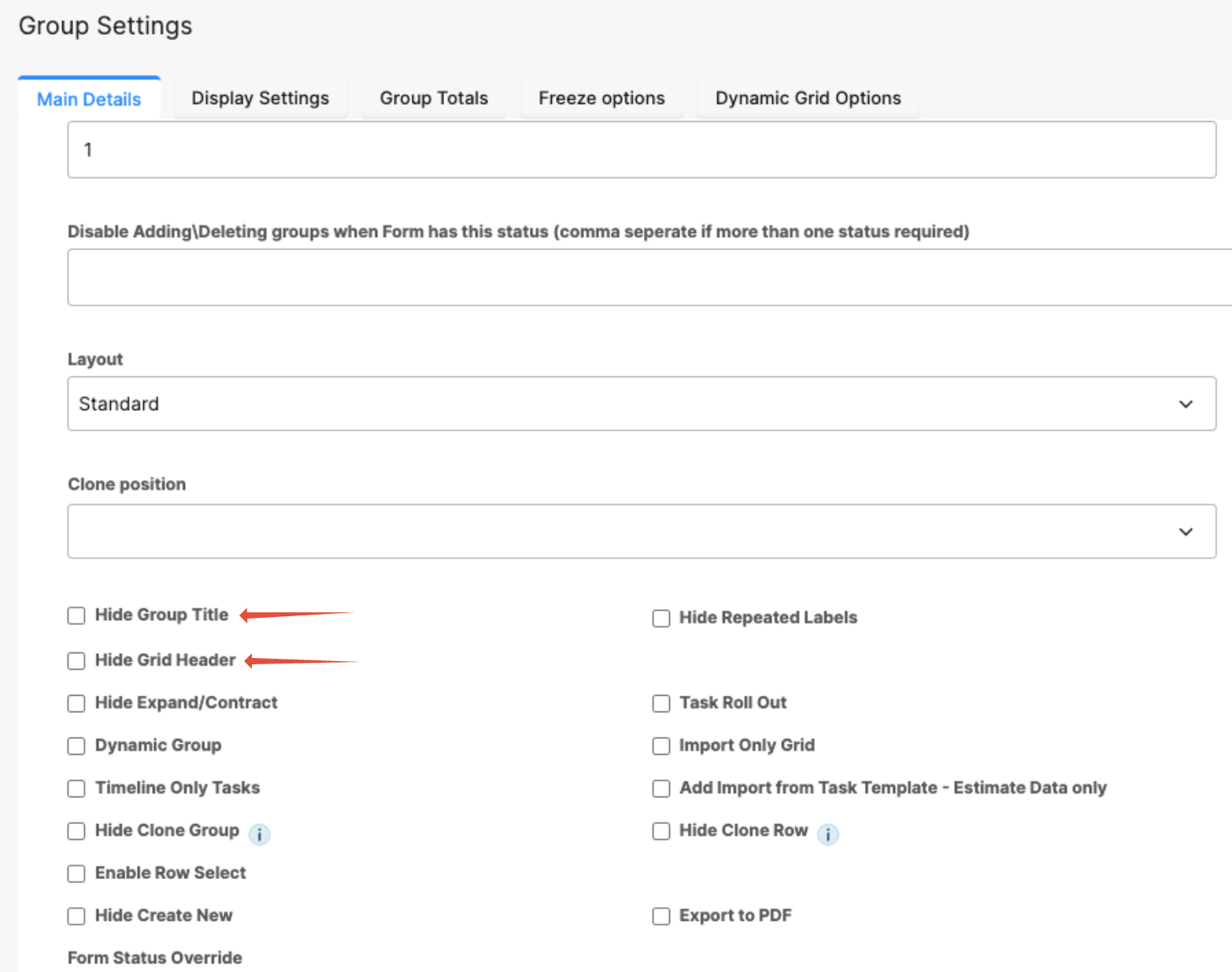
These options are useful when you want the group to appear more like a simple list rather than a table-style layout.
Dependencies and Behavior
Dependencies can be configured at both the group and individual field levels.
- Group-level dependencies allow you to show or hide the entire group based on conditions elsewhere in the form.
- Row-level dependencies apply only within each individual row.
Each row operates independently, meaning visibility or read-only rules affect only the row where the condition occurs.
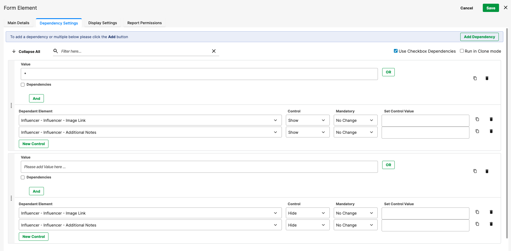
Example:
If a checkbox inside the group hides a related text field, only that specific row is affected. Other rows in the group remain unchanged.
Was this article helpful?
That’s Great!
Thank you for your feedback
Sorry! We couldn't be helpful
Thank you for your feedback
Feedback sent
We appreciate your effort and will try to fix the article