Advanced Field Settings
TABLE OF CONTENTS
- User Field (Advanced Settings)
- Show Guest Users (Toggle)
- Allow Filter (Toggle)
- Access Dropdown
- Group Field (Advanced Settings)
- Access Dropdown
- Date Field (Advanced Settings)
- Number Field (Advanced Settings)
This article builds on the Form Builder documentation, which covers adding and configuring several field types, including User, Group, Number, and Date fields.
This expands on those same field types by exploring their advanced settings and practical use cases. This includes additional configuration options, examples of how these fields can be applied in more complex form scenarios, and notes on how their interaction with other tools and features within the system.
Each section provides guidance on both configuration and real-world usage scenarios to help you make effective use of these advanced capabilities in your forms.
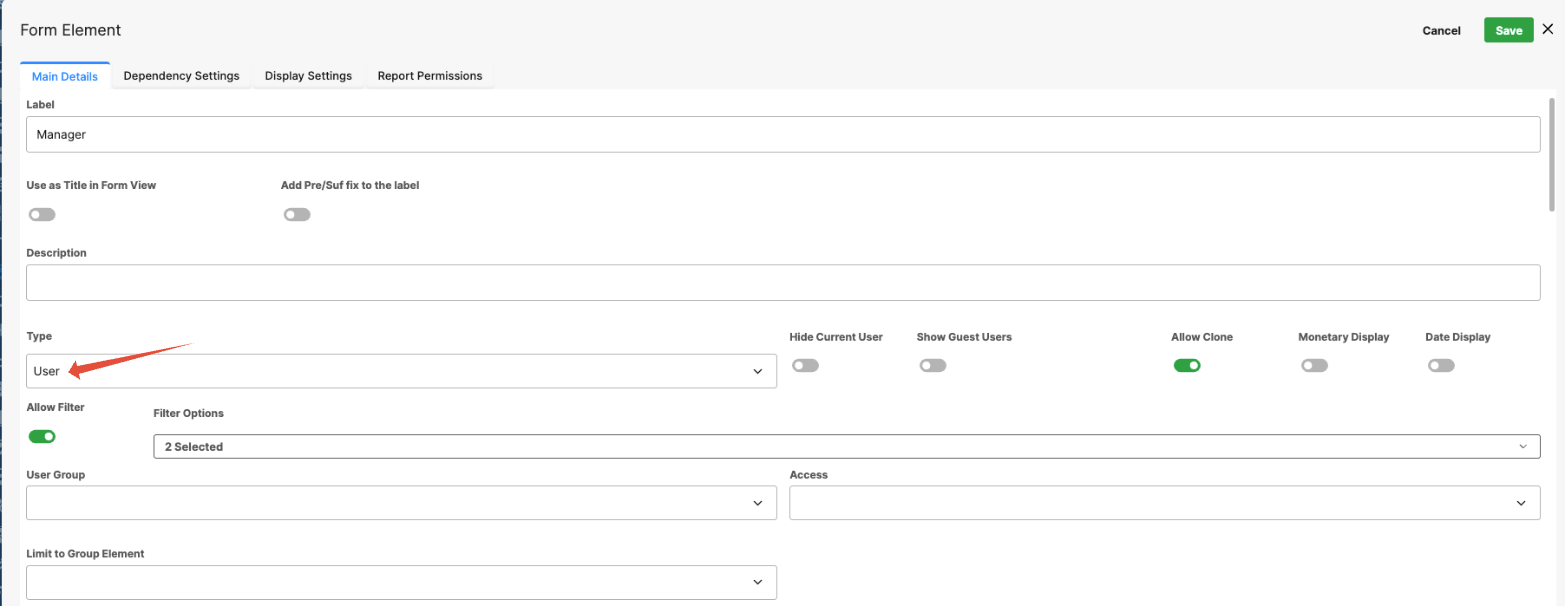
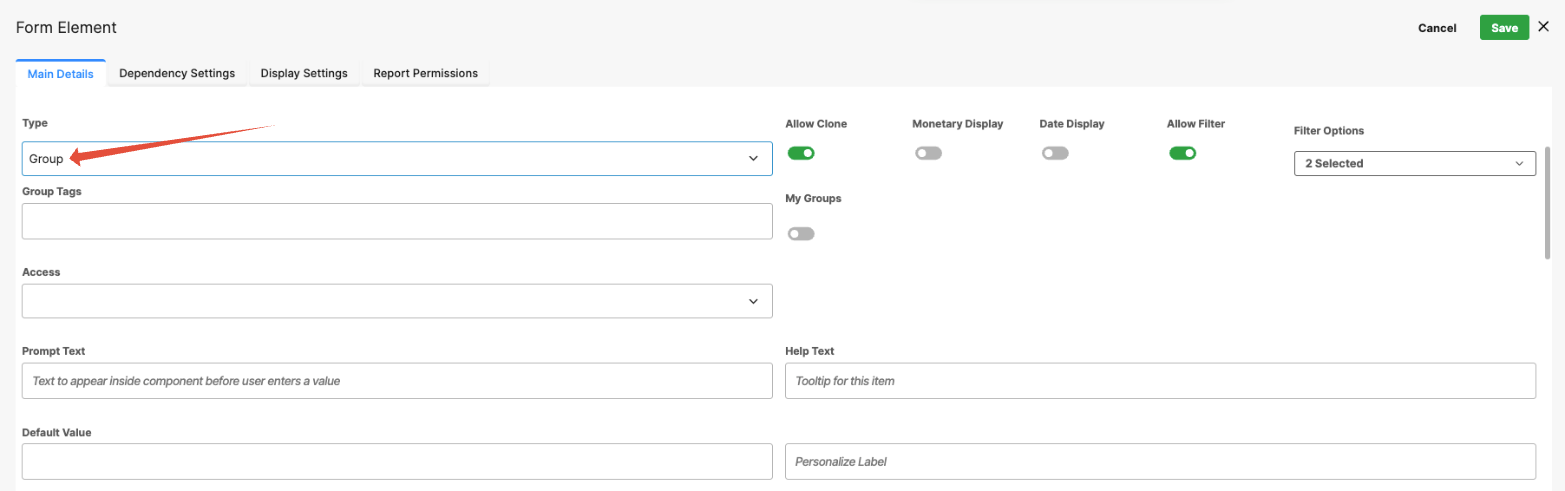
User Field (Advanced Settings)
The User field lets form users search for and select from the system's list of active users. This field type includes several advanced configuration options that control which users appear in the selection list and how the field behaves. By default, the field is turned off and must be enabled.
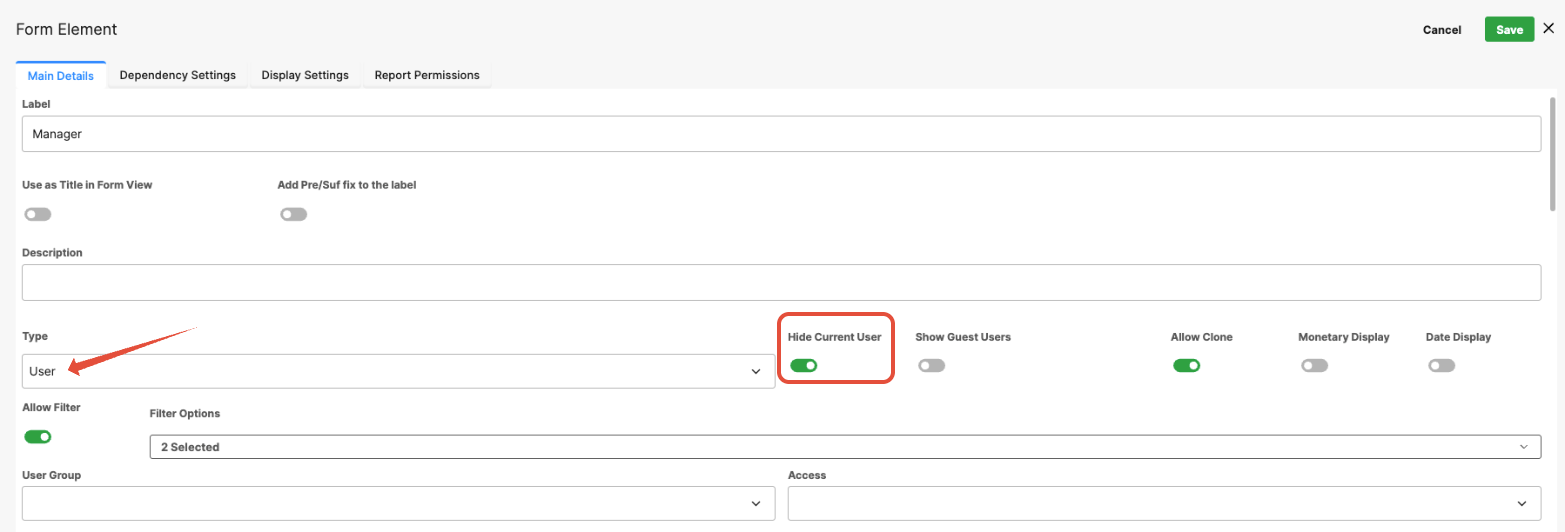
Hide Current User:
When enabled, this setting removes the current user (the person filling out the form) from the list of selectable users.
This option is useful when assigning tasks or approvals to another user, ensuring that the person completing the form cannot select themselves.
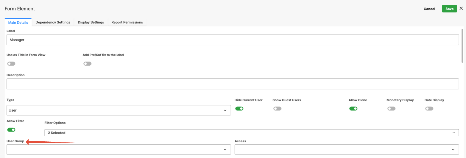
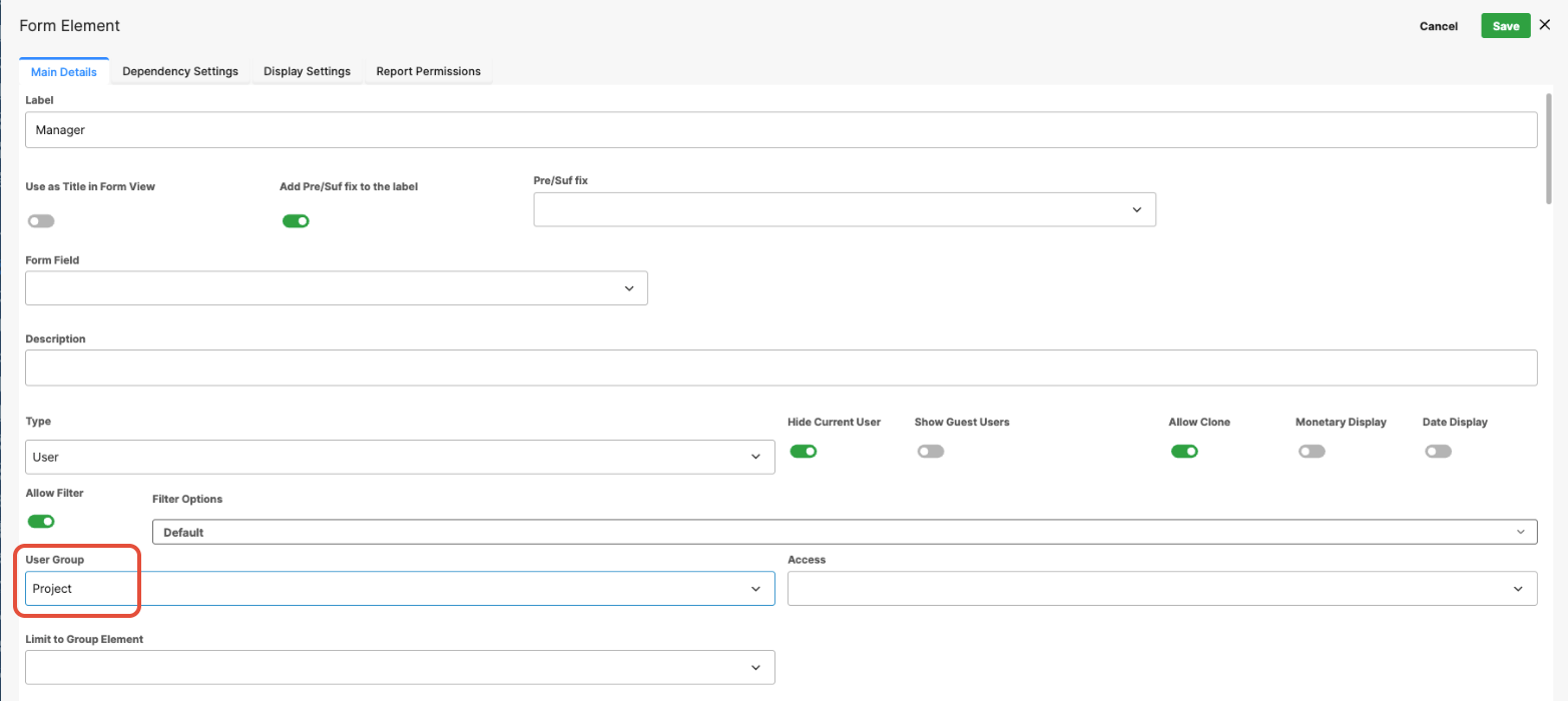
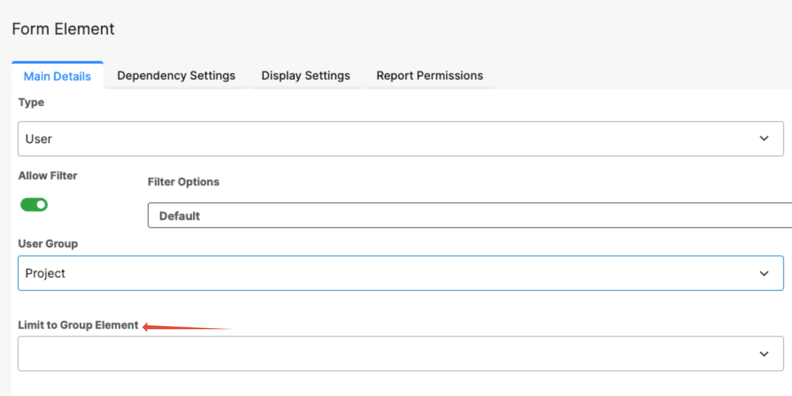
User Group (Static Filter)
Displays a dropdown list of all available user groups in the system.
When a group is selected, the user list is filtered to show only members of that group.
Example:
If a form requires selecting a Project Manager, choosing the Project group ensures that only users in that group are available for selection.
Limit to Group Element (Dynamic Filter)
Instead of filtering users by a fixed group, this setting allows the field to dynamically filter selectable users based on the value selected in another User Group field on the same form.
This is useful when users who are available depend on another selection in the form, such as Region, Territory, or Department.
Example:
If a form includes a field where the user selects a Region, the User field can be configured to display only users belonging to the selected region’s group.
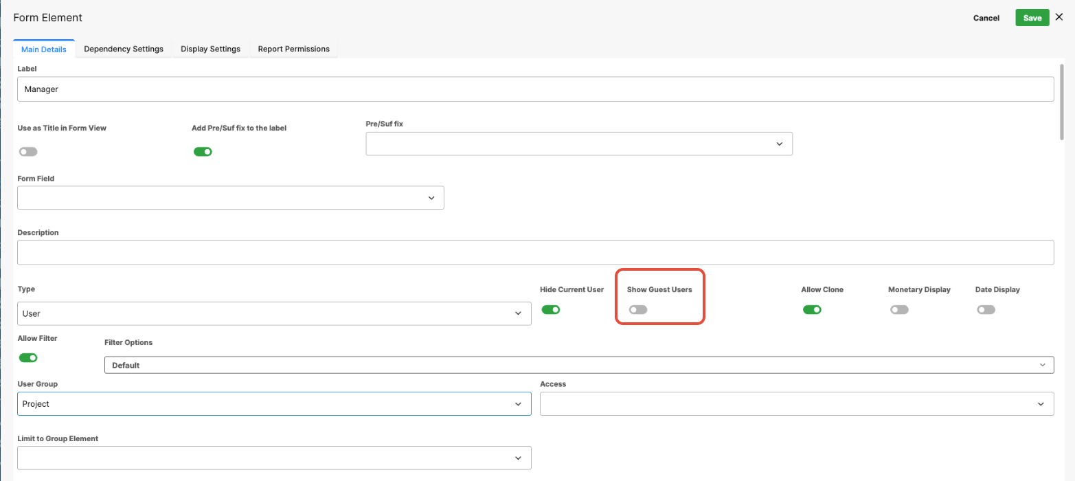
Show Guest Users (Toggle)
When enabled, guest users are included in the list of selectable users. This is useful when external collaborators or temporary users need to be selectable within the form.
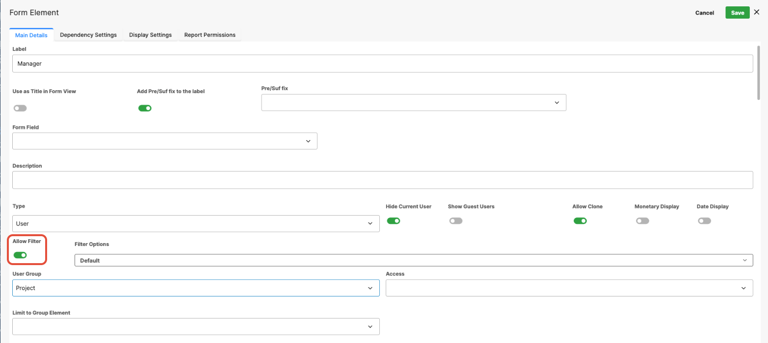
Allow Filter (Toggle)
When enabled, users can apply additional filters when searching for users in the selection dialog.
Helpful in environments with large user directories, allowing faster and more precise user selection.
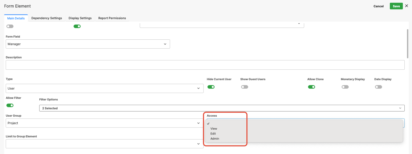
Access Dropdown
The Access dropdown controls which users can view or interact with the field based on configured access rules. It is used when form fields should be visible or editable only to specific users or roles within the workflow or form process.
Group Field (Advanced Settings)
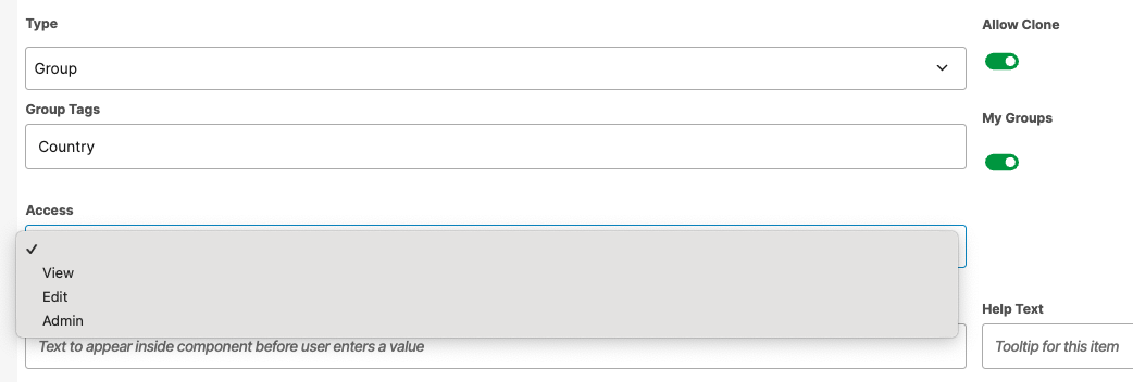
The Group field allows users to select a User Group from the system. Advanced configuration options allow administrators to limit which groups are available for selection, either through group tags or by restricting choices based on the current user’s memberships.
Group Tags
The Group Tags setting limits which groups appear in the selection dropdown by filtering groups based on assigned tags.
Tags are configured when creating or editing groups in User Management. Each tag is defined as text, and multiple tags can be assigned to a group, typically entered as a comma-separated list.
If multiple groups represent countries, each group can be tagged with country.
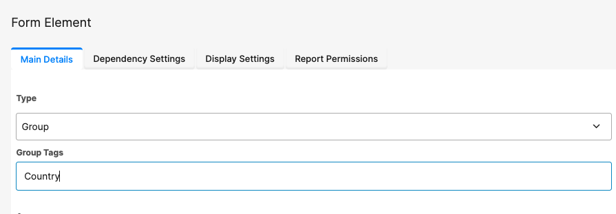
Entering "country" in the Group Tags setting limits the dropdown list to only those groups with that tag.
Multiple tags can be entered, separated by commas (for example, "country", "Europe"). These are applied using AND logic, meaning only groups containing all specified tags will be displayed.
My Groups
When enabled, this setting restricts the dropdown list to display only the groups that the current user belongs to.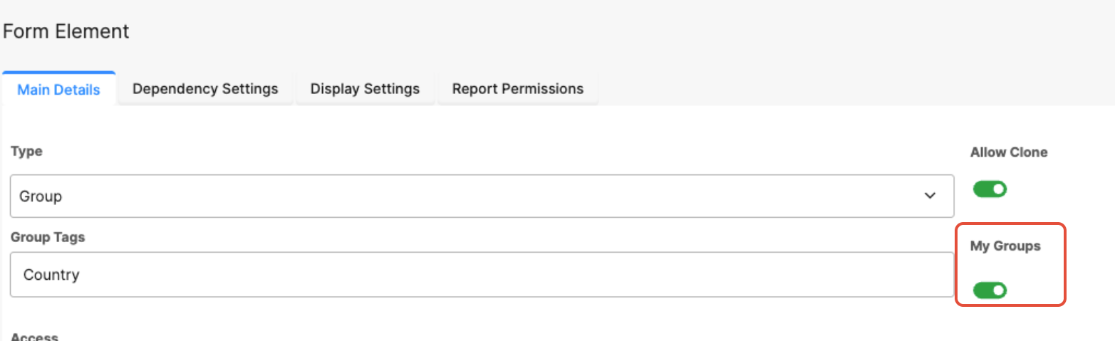
Commonly used when users should only be able to select from groups they are members of, helping ensure correct group selection and reducing errors.
Note:
My Groups can be used alongside Group Tags or other filtering settings.
This supports logic-driven form behavior based on user group membership.
Access Dropdown
The Access dropdown controls which users can view or interact with the field based on configured access rules. It is used when form fields should be visible or editable only to specific users or roles within the workflow or form process.
Date Field (Advanced Settings)
The Date field allows users to select a date using a calendar picker. Advanced settings enable administrators to control how selected dates relate to other dates in the form or to the system submission date.
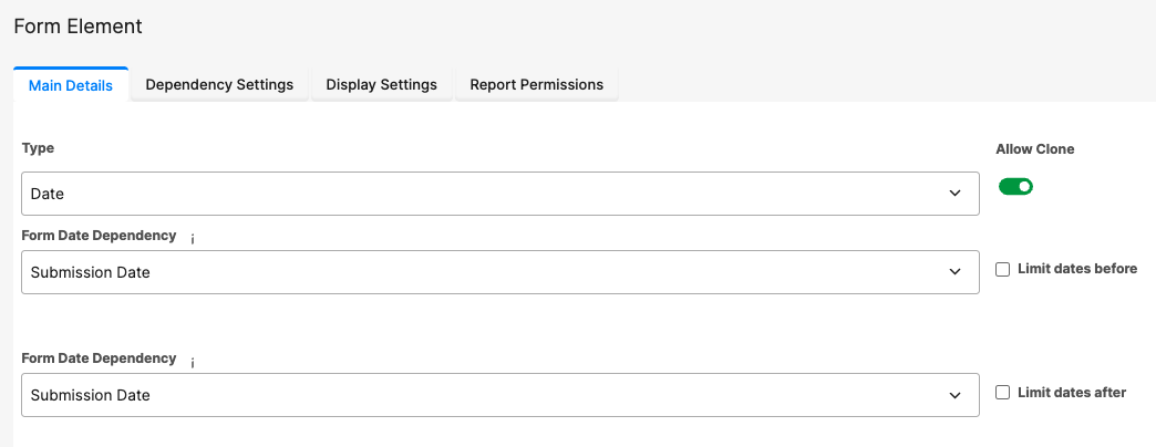
Date Dependencies
Two dependency options are available to restrict selectable dates:
Limit Dates Before
Limit Dates After
Both options are disabled by default and can be used individually or together to control valid date ranges.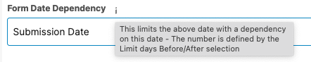
Limit Dates Before
Prevents users from selecting a date earlier than a defined reference date.
Form Date Dependency: When enabled, a dropdown appears listing all other date fields in the form, along with the system Submission Date, allowing you to select a reference date.
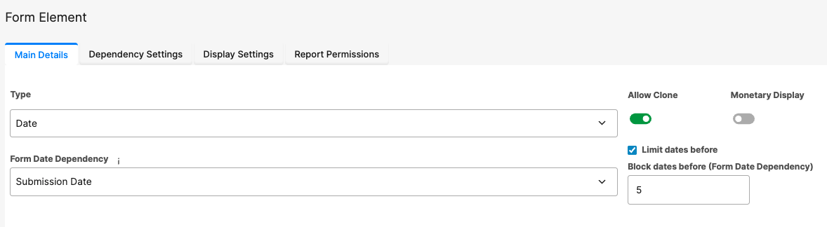
Use Case: Prevent users from selecting past dates by enabling Limit Dates Before, selecting Submission Date as the reference, and configuring the value in Block Dates Before
Form Date Dependency (for example, setting it to 0 prevents selecting dates before today).
Limit Dates After
Prevents users from selecting a date later than a defined reference date.
Use Case: This is commonly used with Start Date- End Date pairs to ensure the end date falls within the allowed range relative to the start date.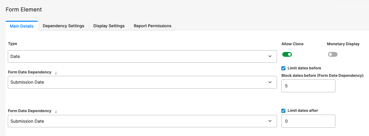
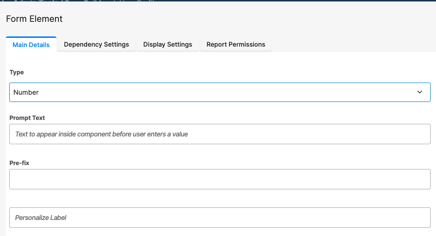
Number Field (Advanced Settings)
The Number field allows users to enter numeric values. Advanced configuration options allow administrators to enforce minimum and maximum limits, either using fixed values or dynamically referencing other fields within the form.
Apply Min/Max Rules
The Apply Min/Max Rules switch controls whether minimum and maximum validation rules are enforced. This option is disabled by default.
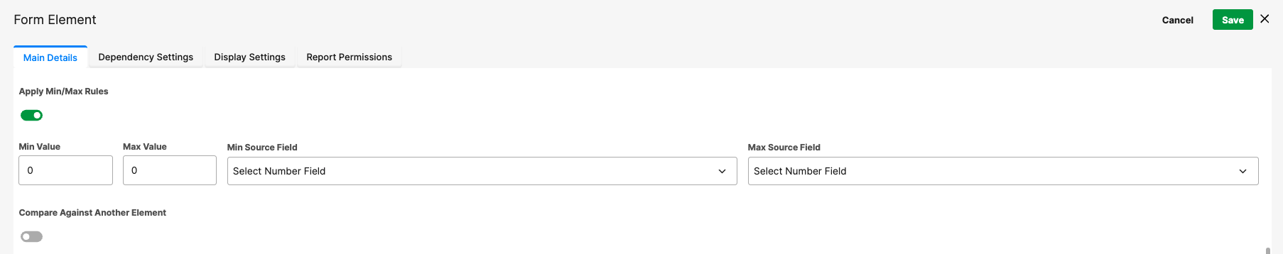
When enabled, users cannot submit values outside the configured range.
Use Case: For example, if a user must enter a score between 1 and 10, set the Minimum Value to 1 and the Maximum Value to 10.
Static vs Dynamic Limits
Minimum and maximum limits can be defined in two ways:
Hard-coded values
Enter numeric limits directly into the Min Value and Max Value fields.
Field-based limits
Use values from other Number fields within the form as comparison limits.
These are configured using:
- Min Source Field — Selects another Number field to act as the minimum value.
- Max Source Field — Selects another Number field to act as the maximum value.
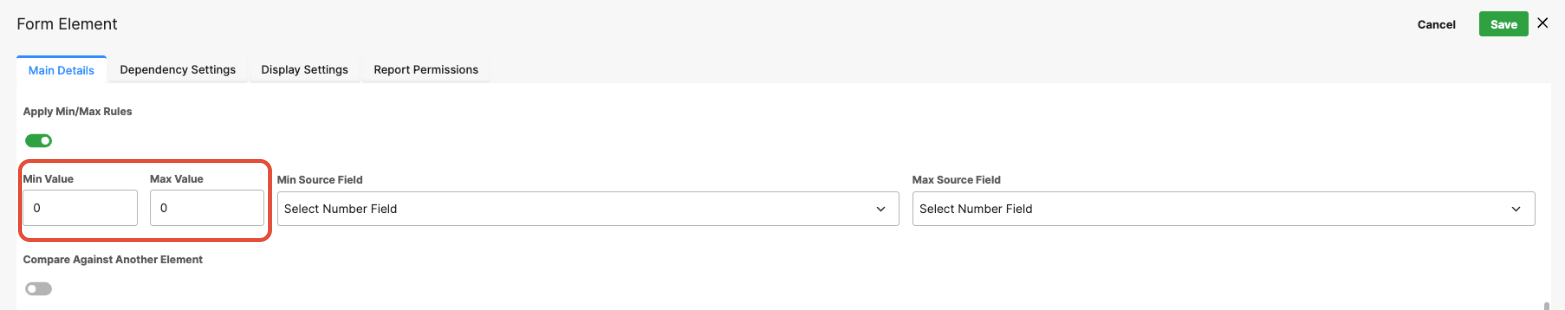
Both approaches can be combined. For example, you might set a fixed minimum value of 1 while dynamically linking the maximum value to another field, such as Total Budget.
Was this article helpful?
That’s Great!
Thank you for your feedback
Sorry! We couldn't be helpful
Thank you for your feedback
Feedback sent
We appreciate your effort and will try to fix the article