Screendragon has a new look
We’ve redesigned the Screendragon interface to make it cleaner, easier to navigate, and more consistent across the platform. The way you work hasn’t changed: your projects, tasks, resourcing, timesheets, and estimates work the same as they did before. What’s different is where things are and how they look.
NOTE
We’re updating our help articles to match the new design, starting with the most-used areas. Until we update an article, its screenshots may still show the previous design. The steps will still work, though, and this guide will help you navigate. Below, you’ll find an overview comparing old and new layouts, and a quick reference showing what has changed.
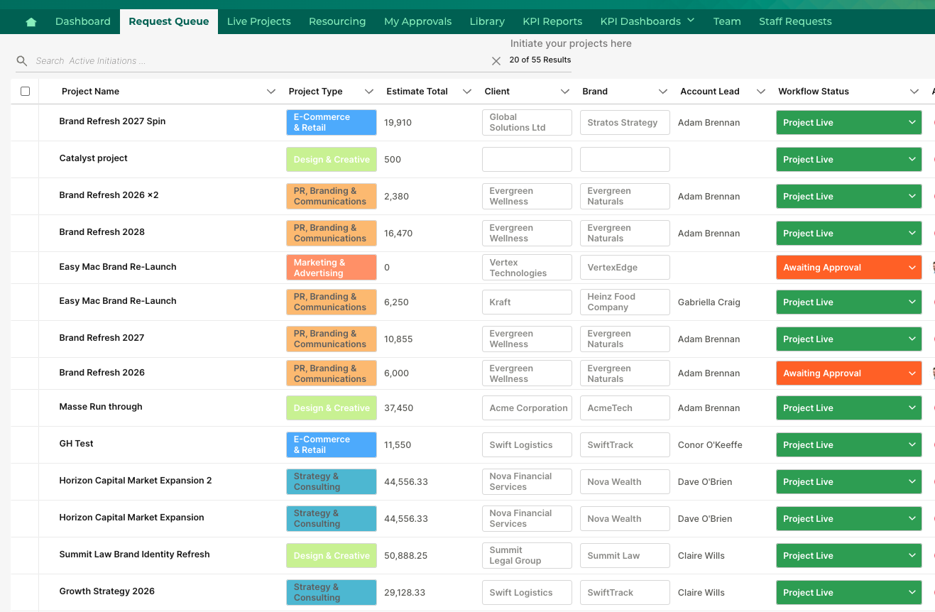
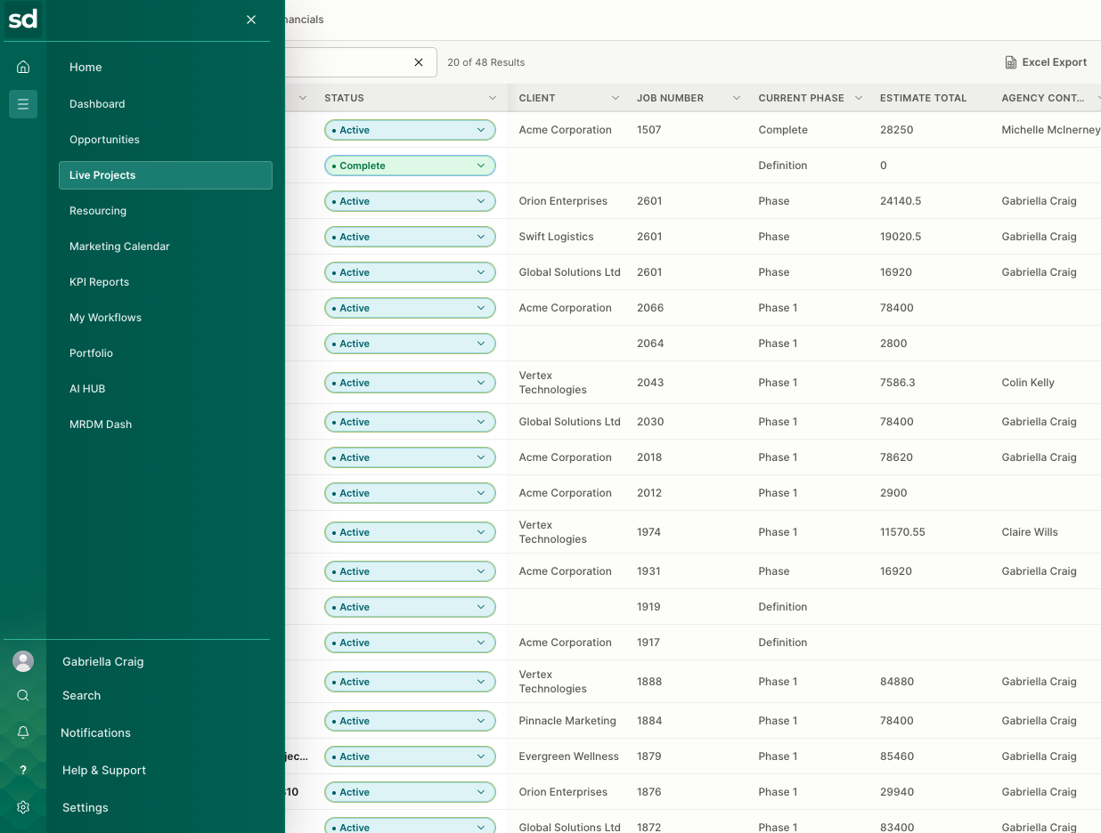
Below is a side-by-side comparison of the old UI (left) and the new UI (right).
 |  |
Screendragon Look and Feel
Previous navigation: Modules sat across the top and views inside a record down the left. With new modules on the way, the top bar had nowhere left to put them.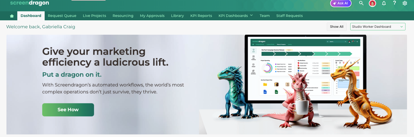
New navigation changes: Moving the main menu into a sidebar gives you more room to work. Most screens today are wider than they are tall, so a left-side menu uses space that would otherwise sit empty and frees up vertical space for task lists, approvals, project briefs, and resource plans. A sidebar also has room to grow and can include new features without crowding the screen. This keeps navigation in one predictable place, so whether you’re moving between areas of Screendragon or between sections of a project, you always know where to look.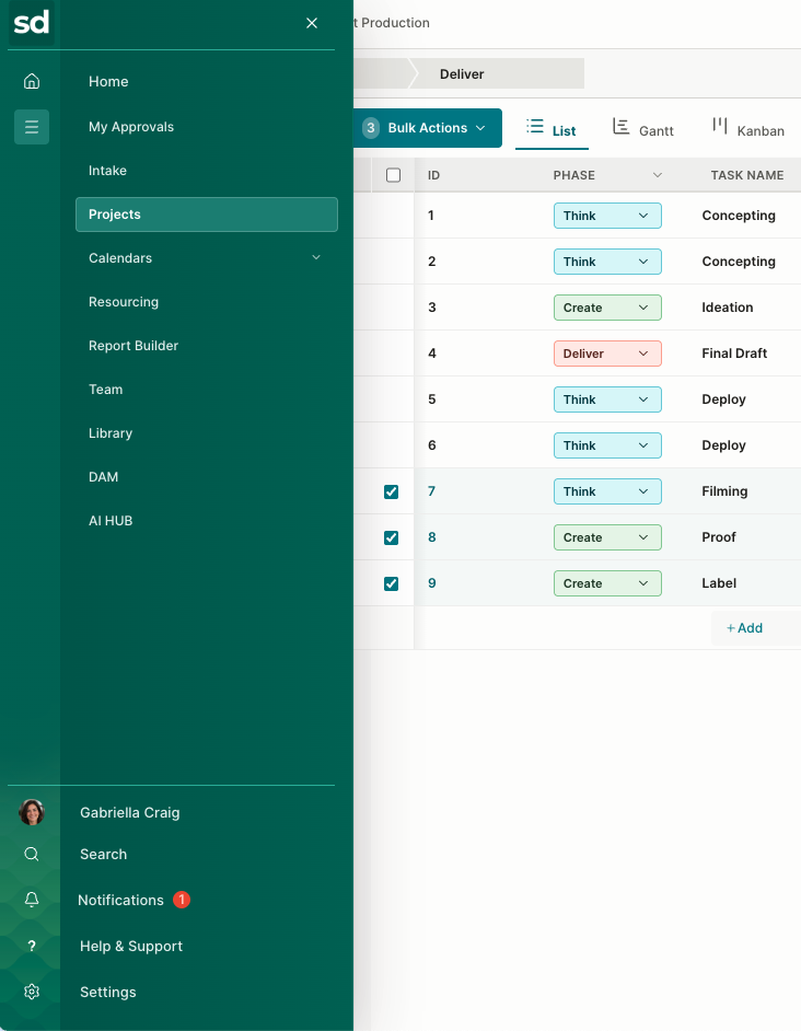
Accessibility: The European Accessibility Act took effect in June 2025, and we’ve redesigned the Screendragon interface to meet its requirements, with a consistent color system and stronger contrast throughout.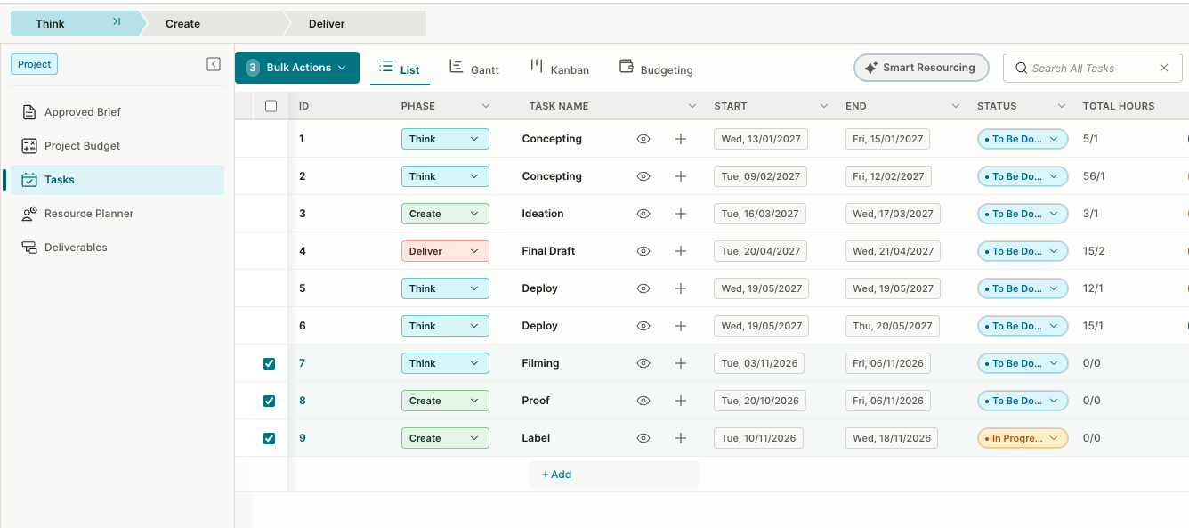
Customized and Consistent: The new interface makes it easy to bring your own branding into Screendragon. You can add your logo, apply your brand colors, and personalize the sign-in screen with your own imagery, so your teams see a familiar, consistent look from the moment they log in. Because the new design is built on a unified color system, your branding carries through the whole platform without compromising readability.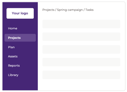
We updated the sign-in screen to feel more modern, give branding more room, and remove the sign-in section covering your image.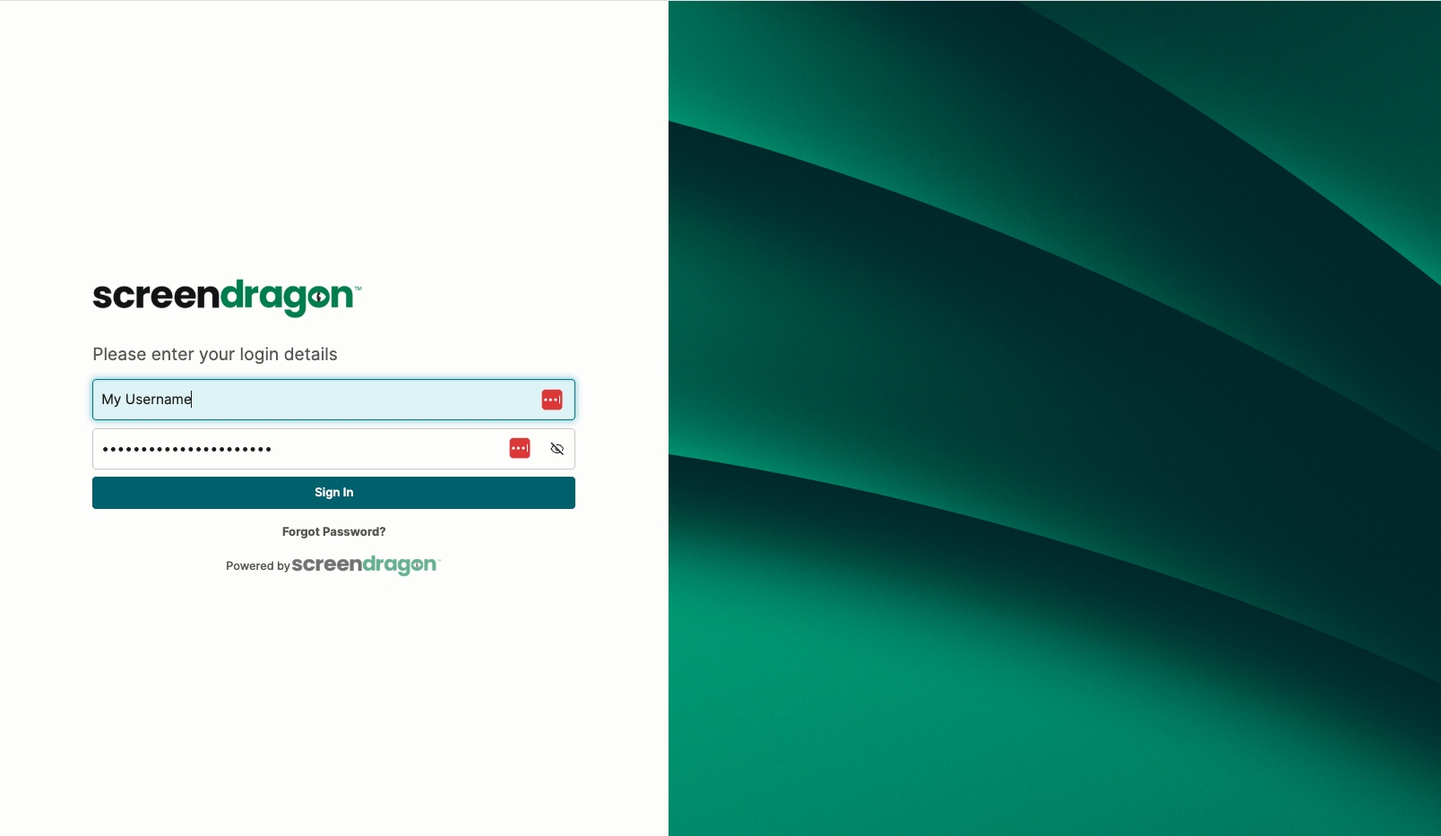
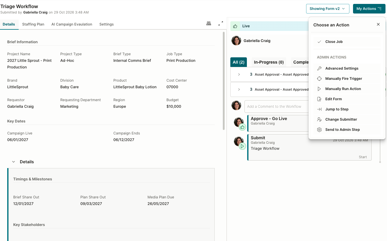
My Actions: My Actions now sits at the top of the audit trail. In earlier versions, it was a floating button in the bottom corner of the screen, and its menu opened at the top of the page. It now sits at the head of the audit trail.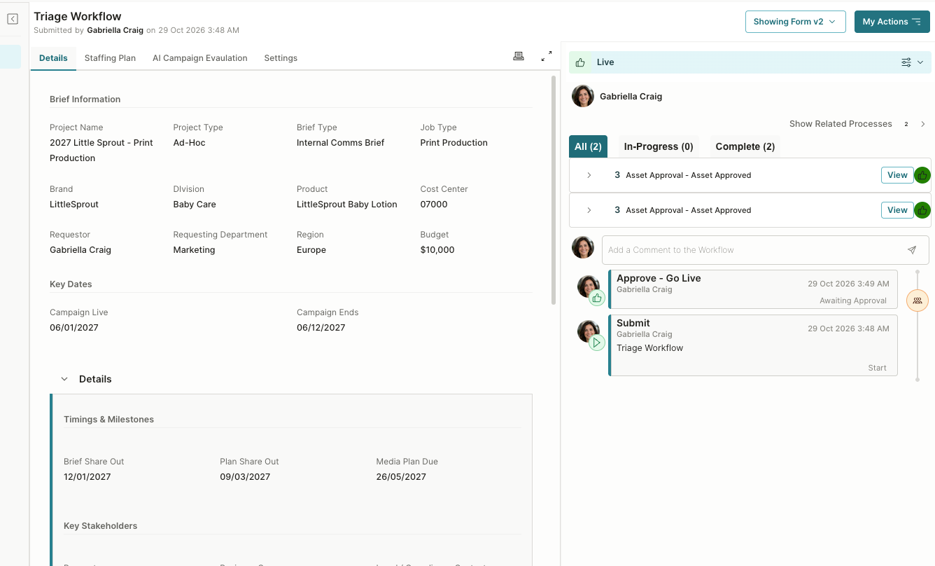
Workflows Design: Workflow steps and actions have a cleaner, more consistent design, so every workflow looks and behaves the same way, with readable colors, consistent names, and steps and actions that look and behave the same in every workflow.
Was this article helpful?
That’s Great!
Thank you for your feedback
Sorry! We couldn't be helpful
Thank you for your feedback
Feedback sent
We appreciate your effort and will try to fix the article